
This is just one of my favourite ways to colour in one of these stunning stamps.
First off, this is what you need; a clear block, a Michael Powell Stamp, (RRP £3.99) some Black Soot Tim Holtz Distress ink (Our price - £4.99) and Payperbox's premium smooth white cardstock.

So, I've stamped on my Michael Powell Stamp, and I'm just loving the clarity! The design is just so crisp and clear, and the Tim Holtz ink is a wonderful quality. It's a true jet black, and it doesn't smudge with Promarkers like some inks do.

These are the Promarkers I'm using to start off with. They're from a set called "Build Environment". The Payperbox card makes an incredible difference too. It's a perfect stamping cardstock and works really well with promarkers, distress markers, distress inks, watercolours and a wide range of other media. RRP £3.99 for a folder of approx 25 sheets.

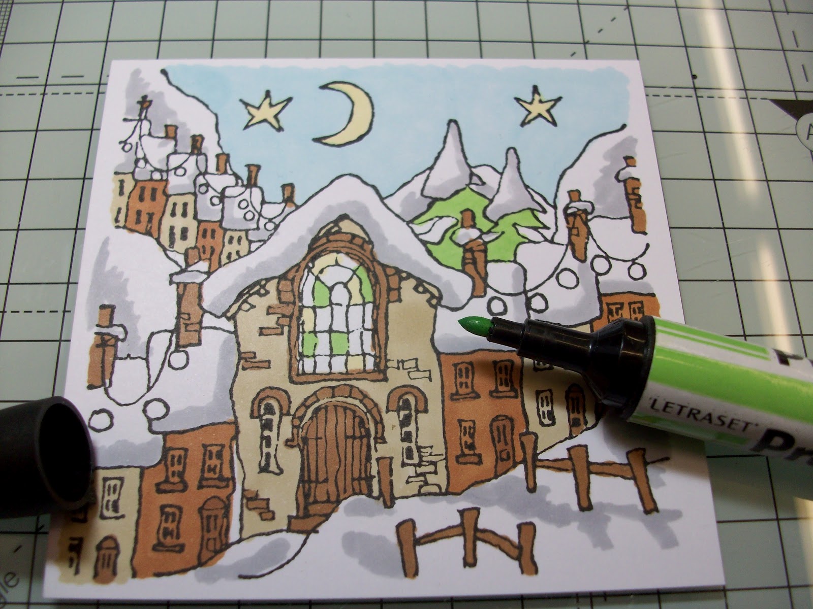
I'm keeping my Urban Stamp next to me whilst I'm working so I can copy the way it's coloured, although I will be using slightly different colors to do it. My first colour is Sandstone, and I'm colouring all the buildings I want this colour first. I'm going around parts of the windows because I want them a darker brown.

And I'm colouring in circles. This is the real secret to Promarkers! If you want that gorgeous solid, almost printed look, colour in little circles and the colour will go on much smoother.

And that's all my light browns done. Next up is the reddy-brown, it's called Terracotta.

And the third brown, Cocoa, is used for all the windowsills, doors, chimneys and other detailing. If you look, I've not been too careful with the light brown! But the dark brown will hide this totally when I go over it, so I can safely cover one colour with another.

And this is the result so far:

Next bit of colouring is the blue sky, again coloured in little circles:

I really love the difference it makes to use a light blue! This one's called Cool Aqua.

And just look at the stamp compared to the stamped image! Sorry Mr Powell, I'm afraid I prefer my blue...

Adding some finishing touches now, this is Ice Grey 3 and I'm copying the shading from the stamp itself to give the illusion of shadows on the snow drifts.


Adding a bit of yellow for the stars, and some on the window:

Green for the trees, and the window:
And some more random colours to fill in the window!

To finish off, I've coloured in the christmas lights and the rest of the window. I've added a "glow" to the lights by drawing little circles around them in yellow.

Ta da! Isn't that just stunning?

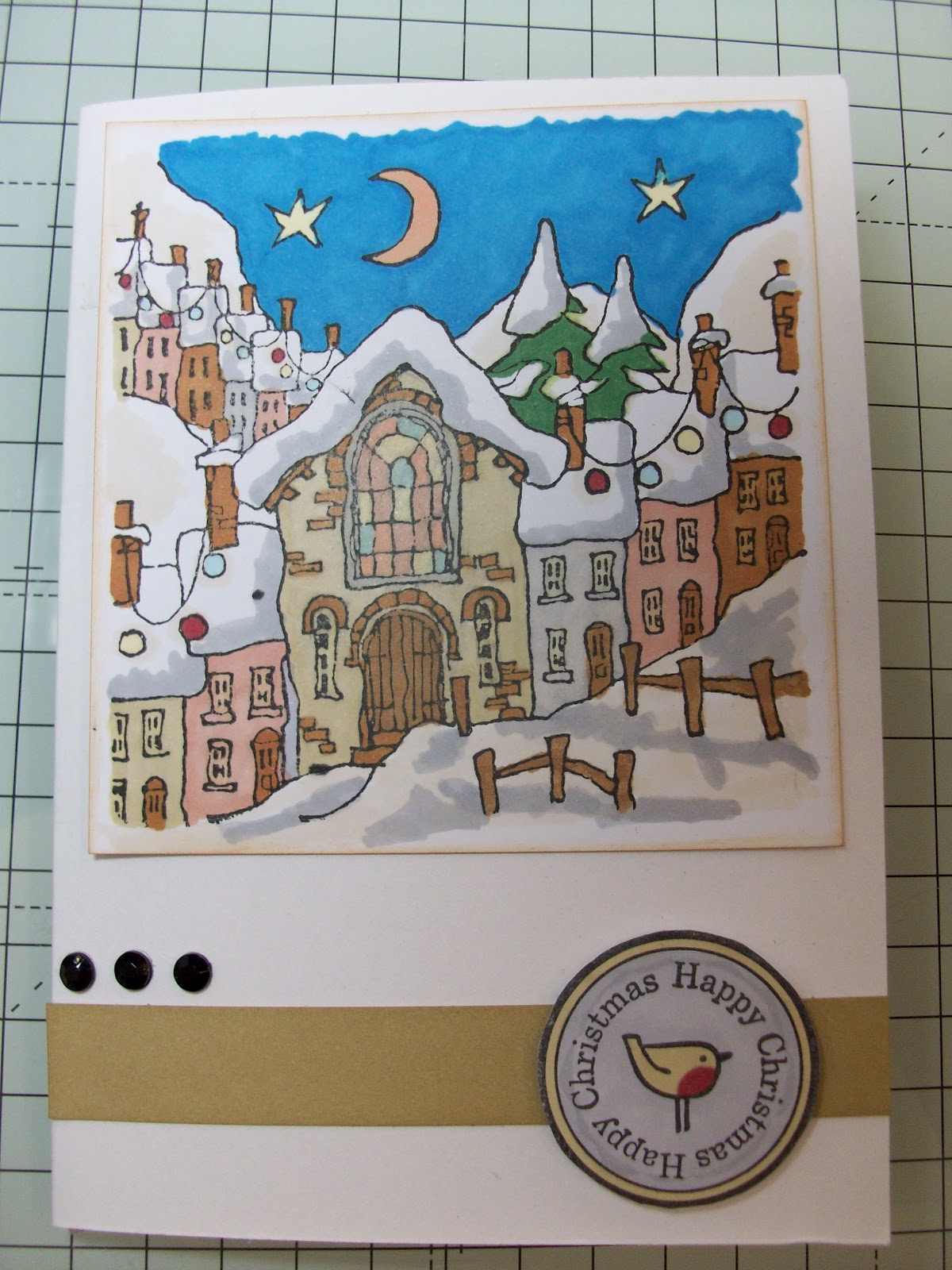
And here are a few cards I've made using the gorgeous Michael Powell stamps with Promarkers:


And the freebie Tulip stamp from the last Creativity Magaizine:

And this is another Michael Powell stamp done in Gold Mica Powders. How stunning is that?!

Hope you've enjoyed!
No comments:
Post a Comment
Please feel free to leave a comment!